
Create Beautiful eBook Design at Scale: A Brief History of the Pattern Library
One of the biggest conversations in the publishing industry right now is centered on formats. From text-only genres like fiction to illustrated content like textbooks and professional references, everyone face challenges around which format to choose for which audience on which device . As Inkling’s Founder and CEO Matt MacInnis recently wrote in a post about our cloud publishing platform, publishers are struggling to stay ahead of the explosion in mobile devices over the last five years. The consumer’s demand for content that works perfectly and looks great on any device is exposing the gap between the fixed layout design of print and the reflowable and responsive eBook design possible in digital mediums.
Since its founding in 2009, Inkling has been grappling with this gap, too. One of our biggest learnings has been that it is possible to capture the spirit of print book design in digital forms when authors and developers initially invest in creating content via structured authoring workflows. While we get into structured authoring elsewhere, this post will focus on how developing a pattern library was the foundation for creating beautiful eBook design at scale.
From Print Pages to Web Pages
Inkling’s early days were filled with discussions about what a book could be. At the time, almost five years ago, a rumored Apple tablet was about to be unveiled and new possibilities for digital content were just over the horizon. We weren’t yet sure how to reshape complicated, long-form content but we were confident the best course was to use the same standards that gave us the Web.
Text and imagery would behave like any web page: clean, semantic HTML for structure and CSS for styling. This approach avoided proprietary markup systems, complicated transformations from code to final product, and would be compatible with existing and future tablets, phones and desktop browsers. Any front-end developer could now build beautiful, customized interactive books using the same skills, tools and technologies they’re used to.
But when we began converting our first print books to digital form we faced new questions. How close to the print design should Inkling’s version be? How can we create reusable components so that books could be built quickly? And how can we keep those components looking great not just on the iPad, but on phones, desktop browsers and future devices?
Categorizing Content
A big step toward addressing these questions came from understanding the process that large publishers use. In planning the structure of a textbook, editors first categorize the content into recurring buckets–introductions, objectives, summaries, quizzes. This ensures that designers can identify content and apply consistent styling. The subject matter and layout will of course differ from book to book but once you know what to look for these repeated patterns are easy to spot.
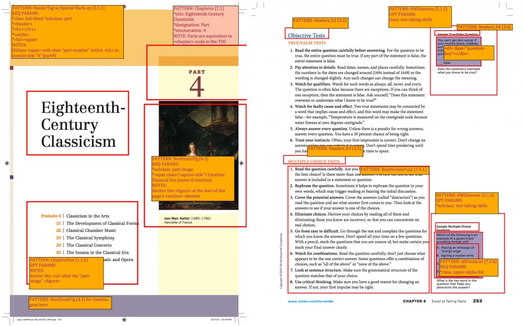
Two early examples of how we added comments to print PDFs to communicate the desired mappings from textbook content to Inkling’s HTML patterns.
This insight lead to our own internal effort at a categorization system mapping content to HTML layouts. Since each publisher used a different system we needed one that not only accounted for their common content categories but also different device layouts and Inkling’s enhancements–video, interactive quizzes, and 3D molecules, among others. We called our collection the Pattern Library: blocks of content placeholders, minimally styled for structure yet easily modified to reflect the design of the physical book.
Parity with Print
Given the limitations of HTML and our need for the content to reflow, it wasn’t realistic to try to duplicate the elaborate designs produced by applications like InDesign. But we did want the freedom to emulate the book’s look and feel to preserve a continuity with the physical edition.
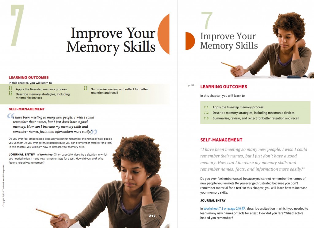
On the left, the original print version and, on the right, the final HTML version.
To accomplish this, we built the Pattern Library so that it makes no design assumptions. Though it does provide building blocks and layout variations (each vetted for cross-device consistency), the font types, colors, and many other user interface elements are up to the designer. This meant that, similar to the way systems apply themes, a unique look could be created by changing only a few variables, leaving the underlying HTML untouched. Or entirely new designs can be created from scratch.
Reusable and Reflowable eBook Design
Writing and troubleshooting cross-browser code is familiar territory for any front-end developer. But in the process of building those early books, we were quickly faced with the unique complexity of maintaining code that was being stress-tested daily by tricky layouts and rendering quirks, all while rapidly expanding the library with new content types and design requirements.
To scale the book-building process, it was clear that our patterns needed be independent objects, capable of maintaining consistent spacing and visual flow regardless of where they were used or the length of content they contained. Additionally, we incorporated the principles of Responsive Design, using CSS media queries to ensure that each part would reflow properly, regardless of device. Publishers would not have to think about all those variations: it would “just work”.
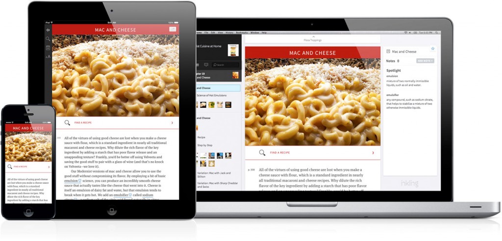
Inkling content is built to look great on any device.
Another tool that aided this process was moving from CSS to Sass. Maintaining the ever-growing list of patterns in a single, ballooning CSS file became unsustainable and Sass provided the escape hatch we needed. Our first step was to divide up the code into discrete chunks over multiple files. Patterns were now self-contained, facilitating collaboration among developers, and better organized. Secondly, using the programmatic features of Sass we were able to DRY out our code, replacing repeated hard-coded values with variables and shortening lengthy blocks with mixins. To see another example of when we’ve found Sass useful, check out this post about how we used a patterns-based approach to eBook stylesheets to transform 850 complex medical titles into beautiful, interactive eBooks with Elsevier.
Freedom to Choose
Over time we refined and refactored, squashed a lot of bugs, and today have a solid collection of heavily scrutinized patterns that are available with every project produced on Inkling. Authors, editors, and developers are free to use and modify them as needed, or create new ones. By working with these patterns, content developers can be freed from worrying about devices and compatibility and focus their attention on what they do best: creating beautiful and useful content for their readers.
To learn more about how Inkling’s approach to eBook design at scale, check out the case study we recently released about our partnership with Elsevier to relaunch their popular Expert Consult and Student Consult, or contact our Sales team to get a demo and see for yourself.
About the Author